
January31, 2025
I find when you work with big prints, you sort of default to only using the colors you find directly in the big print. But there’s plenty of fabric in the world to give us more options. Today we’re stash diving and looking at the Love in Bloom print from our Heart Nouveau line, aka the big focus print. And we’re going to look at the the Lavendula colorway and see if we can come up with some different combinations.

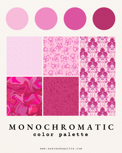
I picked this colorway because it’s got plenty of shades but not a huge variety of colors. All the pinks in the print lean towards cool. You see those big beautiful pink roses and go, “I’m making a pink quilt today so let me use ALL THE PINKS.” Which is how you get the first monochromatic color pull.
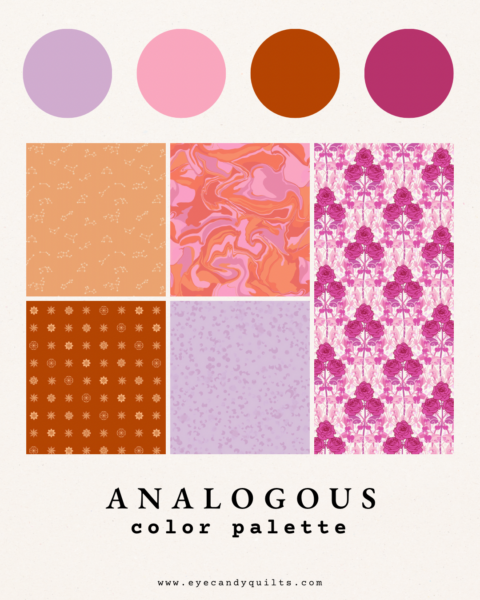
If we go a bit outside of the monochromatic box, we et to an analogous color selection. Remember analogous means they sit next to each other on the color wheel. So for this fabric, that means purple and red (or pushing it farther to orange) go either side of pink. Because this focus fabric has lights and darks, I played with value and pulled out a light orchid color as well as a rich terra cotta. It’s adventurous.
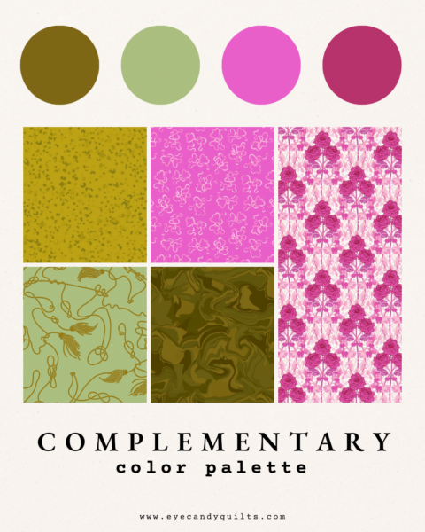
Which leads us to our complementary color scheme, aka the colors directly across from each other on the color wheel. Honestly this feels like the safest color selection, because you can never go wrong with pink and green. Every flower needs its stems and leaves, amiright?