
August6, 2025
Definitely thought this got posted but it must’ve gone down when I accidentally closed all 40 of the tabs I had open last week. Sorry about that! To catch you up, check out the post we did earlier about the overall fabric requirements here and download the full free Palazzo quilt pattern here. But I’m sure you’re curious what fabrics we’re making our quilts out of, right? After all, part of the fun of being Eye Candy Quilts is that there’s two of us so you can see two versions of a quilt during the quilt along, and neither one of us are doing the quilt as shown because we already know what that looks like! So let’s look at what we’ve put together.
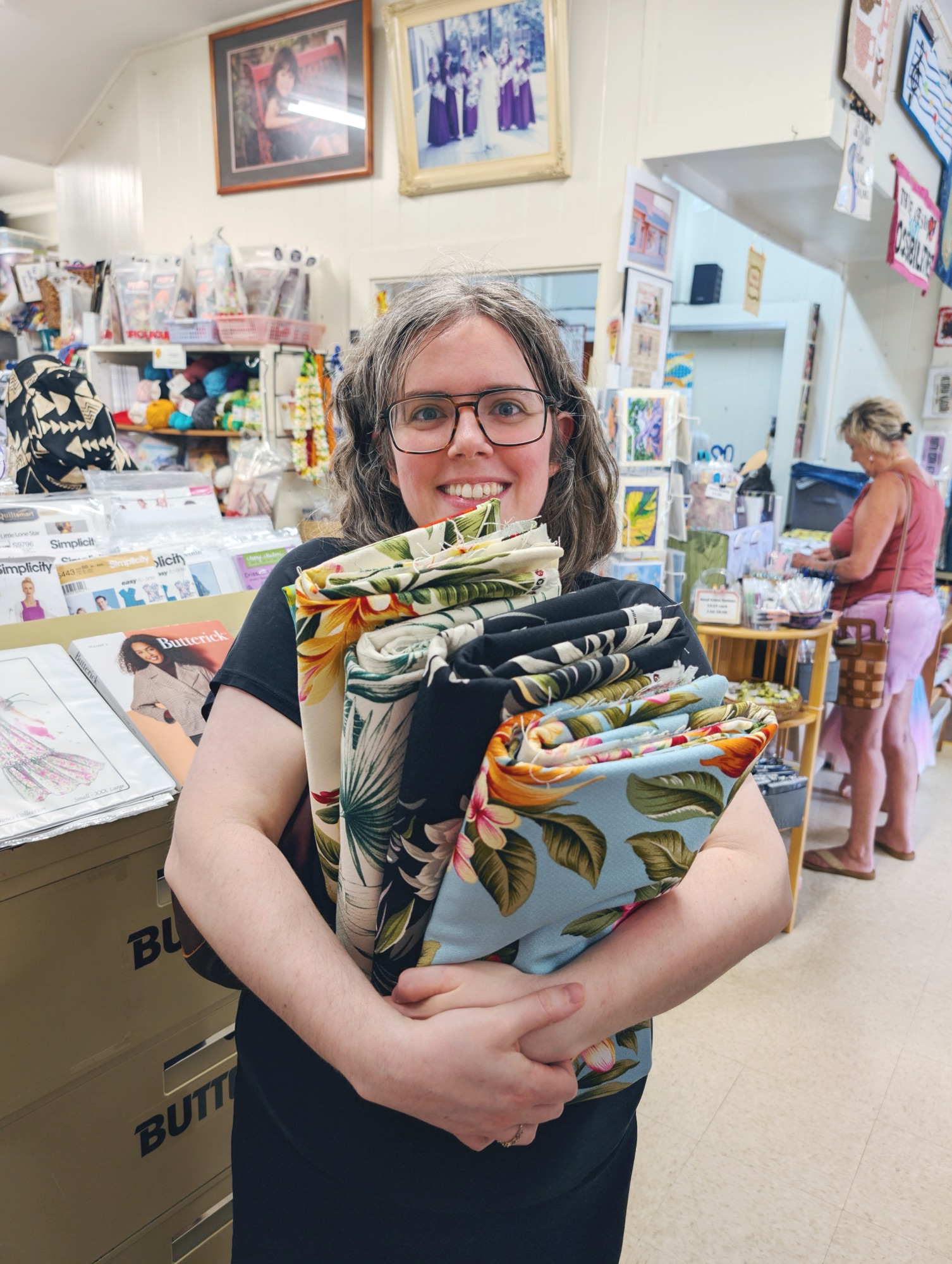
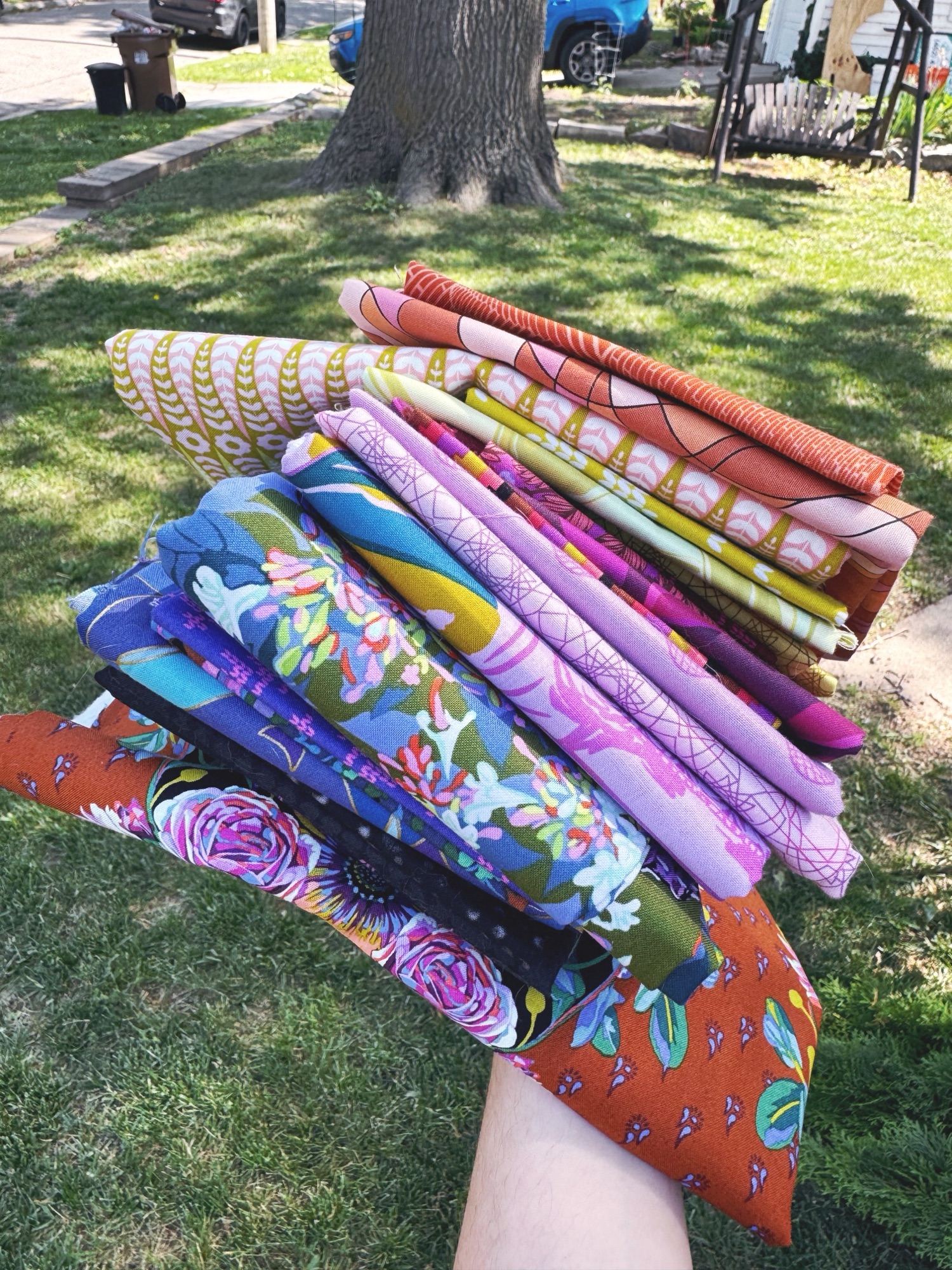
Starting with mine (hi it’s Anneliese here), my husband and I went to Hawaii earlier this year and of course I visited quilt shops. We were in Honolulu for just about a day to go to Iolani Palace and the Bishop Museum, but then we went to Kauai and went to all three fabric shops on the island. I found these bark cloth fabrics at Vicky’s Fabrics in Kapa’a and I got a lot of them, because when else are you going to get them??
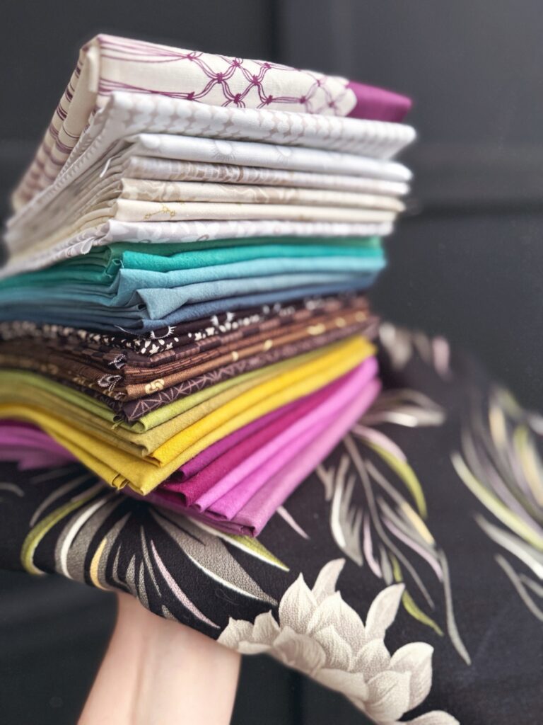
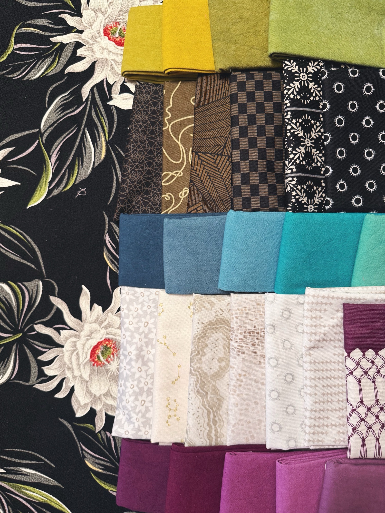
I knew when we got back and I was planning this quiltalong that I wanted to base the color scheme on the black fabric, but definitely make it a mix. For colors, I went to Cherrywood mostly because I never have an excuse to use Cherrywood fabrics and I’ve always liked them. I used to only see them when we traveled to the big quilt shows, so they’re always associated with travel in my brain. Then since the bark cloth is really more neutral than not, I leaned into our Mellow Drama line but scrapped it up with pieces from everywhere, Astrologika, Ciao Bella, Gemma. That’s the best part about being scrappy, no fabric gets left out. If you love it, throw it in.
For my mom’s Palazzo quilt, it started with this beautiful floral border print from Anna Maria. It’s the Beata border print from Good Gracious, one of her last lines with Free Spirit. My mom has always loved her garden and even worked in a greenhouse a long time ago, so this floral with all the summer flowers all together was a must. I also really liked that it didn’t use the typical white or black as the background. It was a good chance to stretch the color muscles.
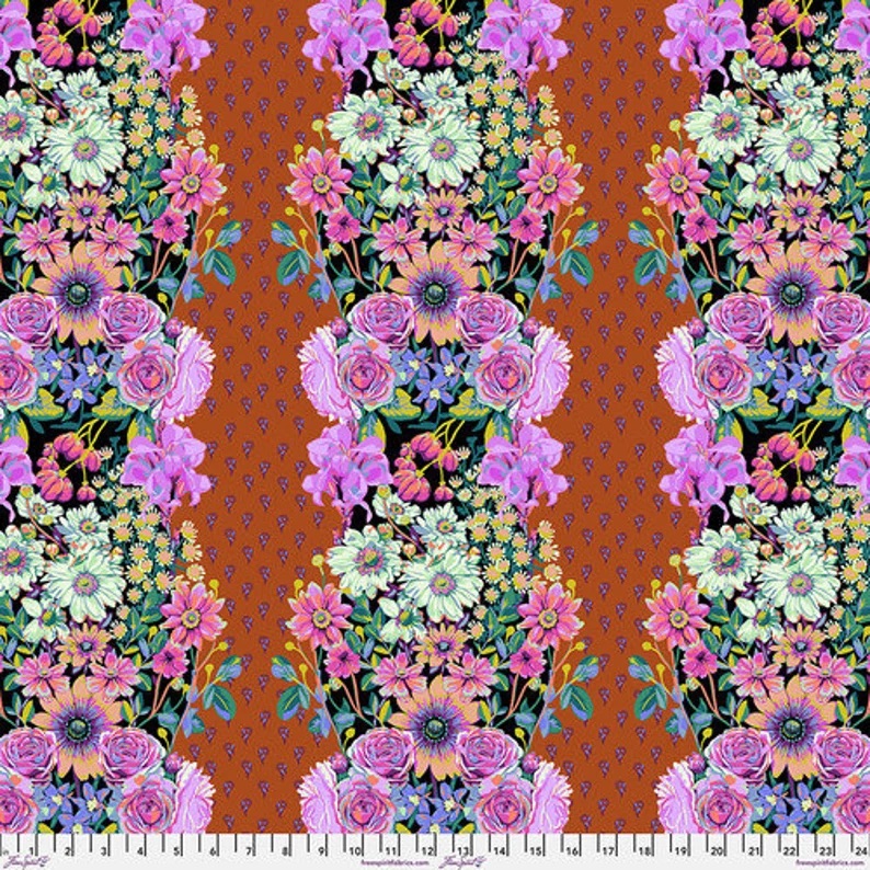
That rich sort of terra cotta burnt orange color was perfect, we even had a Dottir print that matched to use as a background.
We’re making the center of the Palazzo quilt first. Let’s do this!